School of Music students are the stars of Strings Attached, a year-long series of free concerts presented in the UW’s historic Brechemin Auditorium. Boston-based designer Mary Yang of Open Rehearsal created the visual identity for the series, incorporating intricate connections to the Music Building into her work. The final designs—including calendar, posters, sticker, concert programs and totes—bear symbols, signs, and colors taken from musical scores, and from the subterranean depths of the Music Building. She revealed more in a recent interview with the School of Music.
UW Music Q&A: Mary Yang, Open Rehearsal
Q: Youʼve been interested in collaborating with the School of Music for some time. Can you tell us about yourself and your interest in music and graphic design?
A: I am a graphic designer and educator previously based in Seattle, WA and currently in Boston, MA. My interest in working with music extends from my MFA Graphic Design thesis while studying at the Rhode Island School of Design. As someone who has a background in music, Iʼve naturally gravitated towards working with music in my design practice and research. For this project with the School of Music, I was interested in exploring how a visual identity could be informed by the relationship between music and design.
Youʼve designed a visual identity system for our new concert series, Strings Attached. Can you tell us what informed some of the design decisions?
A: When I think about the foundation of graphic design and music, I think of typography and music notes. Both systems use alphabets, which is defined as a set of letters or symbols in a fixed order used to represent the basic sounds of a language. The two systems have these building blocks for generating infinite combinations of words and melodies. Both involve a reading-writing relationship. Building on the idea of “Strings Attached,” I was interested in working with lines as a visual device to connect the musical staff and typography. Each poster contains five horizontal lines that reference the staff and function as a grid for typesetting. When reading music, one simultaneously reads the notes vertically and laterally across the staff. This reading experience informed how the concert calendar was typeset. When it came to choosing a typeface, I had been holding on to one for a while and it just so happened this was the perfect scenario to test it. FIG, designed by Eric Olson, is a trio of fonts inspired by early email and ASCII art. I used FIG Script (an upright script with geometric strokes) and FIG Sans (made up of only the + symbol) as complementary fonts. The way FIG Script connects using continuous lines reminded me of the horizontal lines on a musical staff.
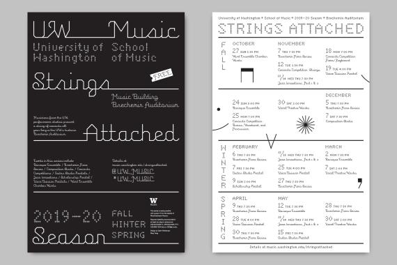
Above: Poster announcing the 2019–20 Strings Attached concert series (Design: Mary Yang/Open Rehearsal).
During my first meeting with Joanne De Pue, Director of Marketing and Publicity at the School of Music, we spent some time walking around the Music Building. In the basement were these painted doors with muted colors. As out of place as they may have first appeared, they actually felt integral to the character of the building. One of our goals was to develop a strategy for keeping the concert programming fresh throughout the school year. We decided to design a large master poster announcing the 2019–20 concert season and three smaller posters for the Fall, Winter, and Spring quarters. Each of the smaller posters contained the same typographic system, the five-line grid, and a flood of color inspired by the doors in the basement. The changing colors also help to signal the new sets of concerts each quarter. The concert programs are a brighter color that help support the muted color palette. Within the printed program system, there are some fun connections such as how the Brechemin Piano Series programs can stack together to form a piano keyboard. Jazz Innovations, a two part concert, features large numbers composed of the concert titles.
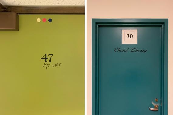
Colored doors in the Music Building basement (Photo: Mary Yang/Open Rehearsal).
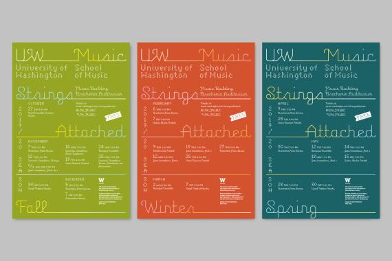
Poster color palette inspired by the colored doors in the Music Building basement (Photo: Mary Yang/Open Rehearsal).
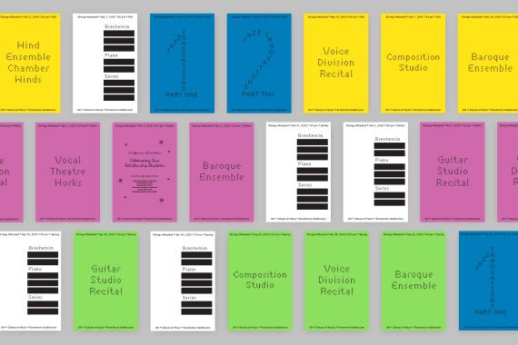
Concert programs for Fall, Winter, and Spring quarters.
What are some other fun elements that the audience might enjoy?
In addition to designing the visual identity, Iʼm also interested in how the work can serve the programming of events. One of the things I enjoyed most while being in art school was the culture of critique. To me, school is an environment to keep practicing oneʼs craft through open critique and dialogue. Since many students in the School of Music are required to attend these concerts, I added a “Critique on Performance” section to the printed concert programs. Youʼll also notice there are a few musical notations floating around on the posters. I chose to include these musical notations (up down, down bow, and pedal up) since they are also gestures (or strokes) found in the FIG Script letterforms. One of the last pieces I designed was the tote. Joanne and I decided to print the concert calendar on the tote, literally making it a “traveling poster.” Iʼm excited to see how the identity can generate curiosity, excitement, and most importantly make music fun!
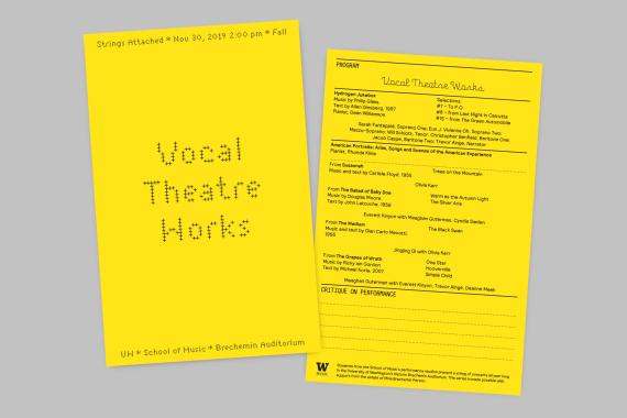
Details of the front and back of a concert program (Photo: Mary Yang/Open Rehearsal).
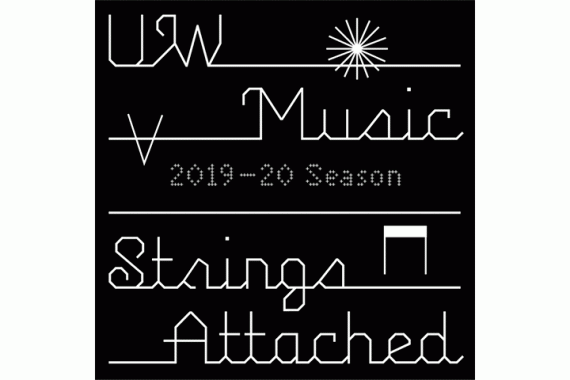
Musical notations relate to the strokes of the typeface (Design: Mary Yang/Open Rehearsal).
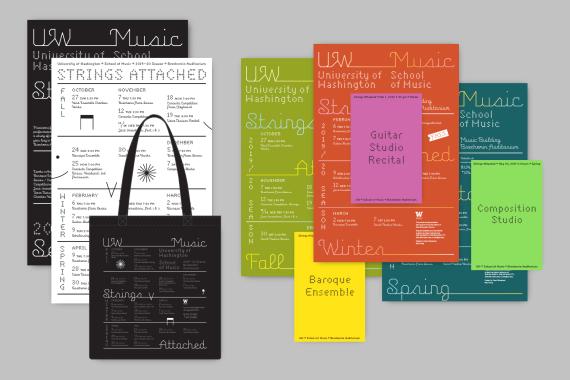
Overview of the visual identity system.
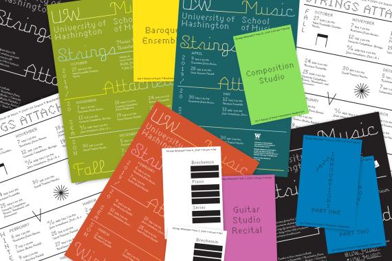
All posters and concert programs.
Mary Yang is a graphic designer and educator based in Boston, MA. She runs Open Rehearsal, an independent design practice that works with clients and collaborators in the arts, music, and academia.